BPI Mobile App

Concept
UX Design
Research
Prototype
Design Challenge
Simplify the everyday banking experience by creating a delightful, easy-to-use, and informative mobile banking app.
Tools
Figma, Photoshop, Illustrator
I. RESEARCH
Apr 2014 - Mar 2015
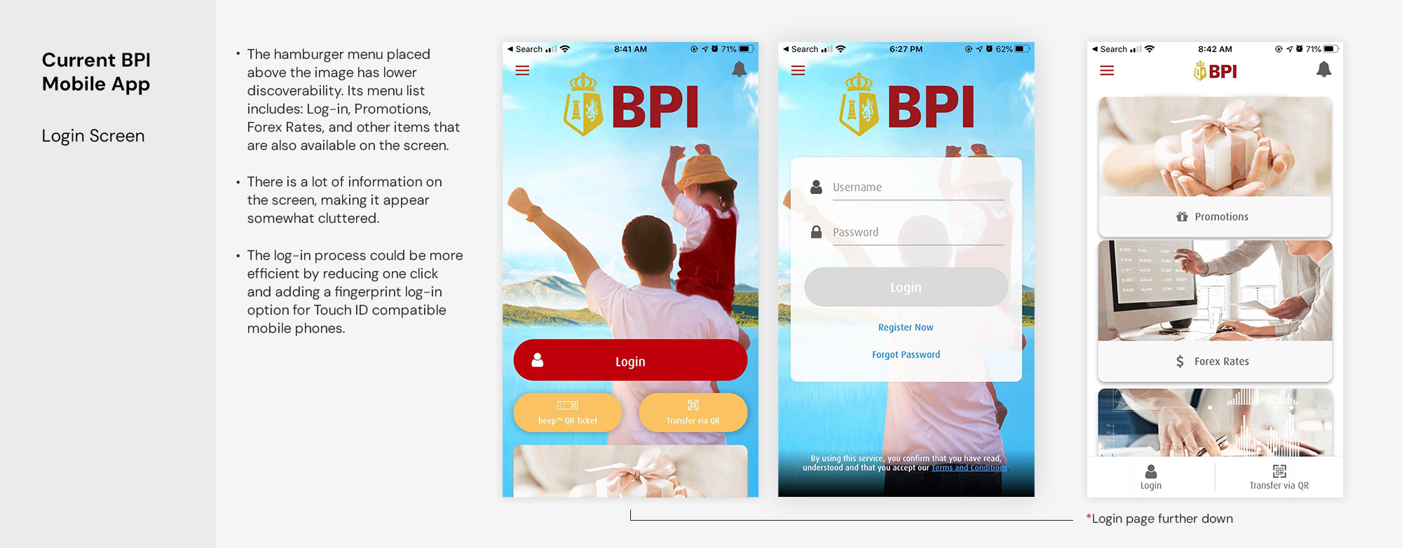
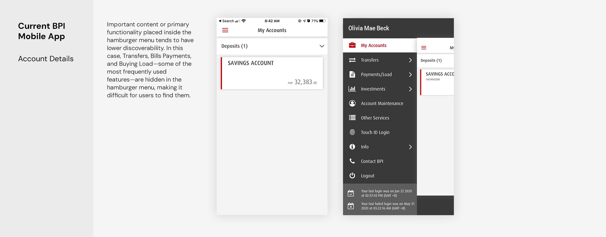
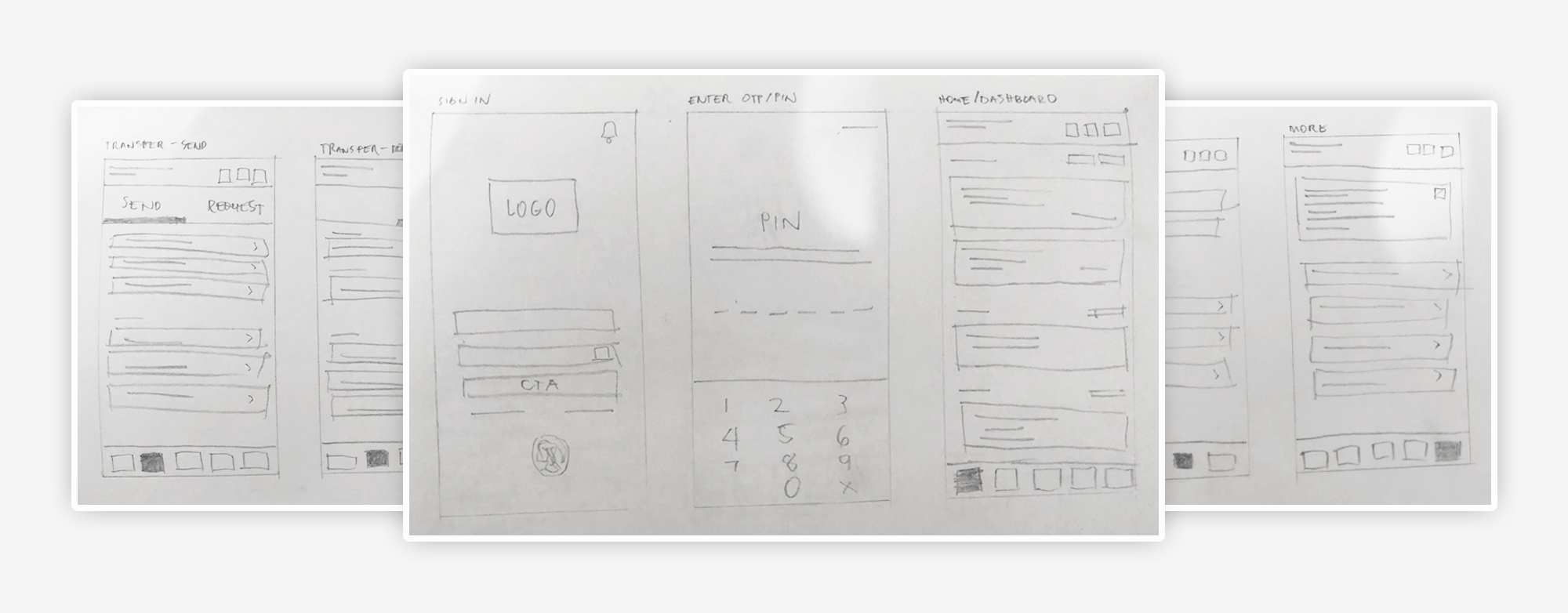
Current State Analysis
Before diving into the redesign, I analyzed the current state of the BPI mobile app to identify key issues and areas for improvement. In the following analysis, I will primarily focus on the basic features of most mobile banking apps: checking balances, paying bills, transferring funds, and viewing recent transactions.
I. Research
Apr 2014 - Mar 2015
Competitive Analysis
To gain more insights, I looked at a few competitors, including mobile apps offered by traditional banks, digital banks, and banking-related apps. Additionally, I reviewed the features and functionalities of popular mobile banking apps from other countries. Some of the inspirations I drew upon were UnionBank, ING, and Citibank.
I. Research
User Interview
Apr 2014 - Mar 2015
In the beginning, it was only a personal frustration that led me to do this project of redesigning the app. However, in order to back up my research, I needed to see things from other users’ perspective. I interviewed 4 users of BPI mobile app and conducted an online questionnaire to find out how people use the mobile banking application. 19 people responded to the survey consisted of both experienced and casual users. I asked them basic questions and I required them to perform specific tasks in the app.
Key Findings:
  • Many users used the app to transfer money, pay bills, check balances, buy prepaid load, and review transaction history (most to least).
  • Many users struggled to pay their bills on the mobile app because they needed to enroll the biller account first through the website.
  • Many users recommended having a "save account" option for recurring transfers and bill payments because they find it inefficient to manually populate the fields each time.
  • Many users used the app to purchase prepaid load.
  • A few users want the ability to customize their dashboard by naming their bank and biller accounts.
  • Some casual users struggled with navigating specific functions of the app.
I. Research
App Store Reviews
Apr 2014 - Mar 2015
To complement the user interviews, I looked through the App Store to see what other users had to say about the app. While some comments praised the app for its clean and simple UI, many users complained about the missing features and functionality.
II. IDEATE
User Persona
Apr 2014 - Mar 2015
Using all the information gathered from interviews and survey results, I created 2 personas representing user behavior and pain points. This will help me better empathize with users and prioritize goals according to their needs.
II. Ideate
Apr 2014 - Mar 2015
Information Architecture
The information architecture maps out which screens are required and all the user interface elements that make up the structure of the app. Having everything in one place makes it easier to organize the content and identify areas for improvement.
II. Ideate
Low-fidelity Wireframes
Apr 2014 - Mar 2015
Taking it a step further, I began by making sketches on paper to quickly visualize the initial flow and layout of the product. Usually, I create wireframes directly using a design app, but this time, I wanted to practice making wireframes using pen and paper. Below are some photos of my quick sketches.
III. DESIGN
Apr 2014 - Mar 2015
Mockups and Prototypes
In this personal project, it seemed important to me to retain the BPI branding and not make too many changes to it, as most users liked the simple and clean interface of the current app. However, I still wanted to try to improve the UI design of the app to make it more modern and intuitive without losing its branding.

Home Screen and Account Details

What changed?

  • We mentioned earlier that the main downside of using a hamburger menu is its low discoverability. So, as an alternative, I created a bottom navigation bar for the most-used features of the app. With this change, it's much easier for users to have direct access to these features, making the experience more efficient.
  • Instead of a simple white block card, I added colors to it to make it easier to distinguish between different types of accounts added to your account. These colors are based on the actual BPI cards to avoid confusion for users.
  • Other features like Promotions, FX rates, Activate Credit Card, Deposit Checks, Branch Visit, and other functions were moved to the bottom of the dashboard instead of being placed on the login screen. (Although Deposit Checks and Branch Visit are still not yet part of the features of the current BPI app, it would be good if they were included in the next updates.)
  • In the account details, users have the option to name the cards added to their account. For example, if they have two savings accounts added to their app, they could rename one as "My Savings Account" and the other as "My Payroll Account," depending on their preferences. This will help avoid confusion if they have multiple cards added to their accounts.
  • Recent transactions are color-coded in green (incoming) and red (outgoing) to easily track cash flows.

Transfers (Send and Request)

What changed?

  • I fixed the structure and layout of the transfer process. I made all the steps fit into a viewable mobile screen to avoid scrolling (see the GIF above for the simple step-by-step process of transferring from own account to other banks).
  • Added features like Add/Save Contacts and Scheduled Transfers for recurring transfers. If we remember during our interviews, a lot of users suggested to have this feature in the app. This will help users to avoid filling out repeating information in the future.
  • Added "Notify the recipient" in the transfer process for users who want to notify their recipient through SMS and/or email for confirmation of the transfer. This could be a good alternative instead of making a screenshot.
  • There's also a "Request" Tab option for users who wants to request payment via QR Code making it more easy to transfer money without having to fill out all the required information.

Bills Payment

What changed?

  • Paying bills is made easy by having a list of billers included in the mobile app, as opposed to needing to enroll the account biller through the web before users can actually pay it using the mobile app (see the GIF above for the simple step-by-step process of paying bills)
  • Just like in the Transfer feature, the Bills payment also has Save Biller and Scheduled Biller options for future transactions. This will save a lot of time for recurring payments.
  • Users can easily check their payment history by accessing the Recent Activities tab. This will help users track their previous and recent activities.
  • I've added a reminders feature to avoid late payments in the future.

Buy Load (Prepaid and E-Wallet)

What changed?

  • There hasn't been much change except for the UI design. I added a recent purchases option to track previous transactions, and I had the idea of including this feature in the bottom navigation bar for easy access, as many users used the app to actually buy load.
  • I also have to commend the current BPI app for having a "Load E-wallet" option. This saves a lot of time instead of going to a payment center or making over-the-counter payments.
IV. CONCLUSION
Final Thoughts
Apr 2014 - Mar 2015
I took on this challenge because of the real-life problems I have faced while using the app. The redesign ideas were developed with limited information, based solely on personal research, input from current users, and App Store reviews. I am aware that there are many areas for improvement, particularly in terms of research, and I haven't conducted any testing to validate my solutions. I don't claim that every decision I have made to redesign the app is better than what exists now. I simply used this as an opportunity to practice and improve myself as a UI/UX designer.